Aman.com
Information Architecture
Content Strategy
User Experience
Web Design
Guidelines
While at And Partners NY
With Olivia Flory
Overview
Aman is a global luxury resort group with 32 destinations in 20 countries. They cater to a niche, affluent customer base who expect best in class service.
Aman.com was first launched in August 2015. Budget limitations have resulted in limited UX enhancements since the website’s implementation.


information Architecture
Discovery & Problems
The launch of new product verticals were not considered when pre-existing page templates were designed. This resulted in a fragmented site architecture; inconsistent and disconnected hierarchy; and redundant content.
Approach & Solutions
Audit and restructure the website architecture, content and user flows so the user’s navigation and discovery process is more intuitive; maintaining continuity across the brand’s portfolio of 32+ unique destination-level sub-pages.
Content Strategy
Research & Discovery
The organic growth of the business over the years without any universal guidelines, had begun to show itself in the inconsistent tone of voice, CTAs, product description lengths, photography, and overall content flow across their portfolio.
CTAs were not consistent or clear about where they directed the user.
Similar content was being inconsistently detailed across the website
Clarification between residences and residences was needed, as was the relationship between the two.
Approach & Goals
Ensure CTA messaging aligns with user expectations while navigating across the various content types: Destinations (Resorts & Residences), Accommodations (Villas & Casas), Experiences (Wellness, Adventures, Etc.), and Exclusive Offers (Packages).
Audit the use of language across the website (CTAs, product descriptions, image captions).
Define standards to reevaluate content strategy.
Create a modular, rule based system that the internal team can adhere to when expanding their portfolio.
Design & Solution
High contrast for legibility and accessibility.
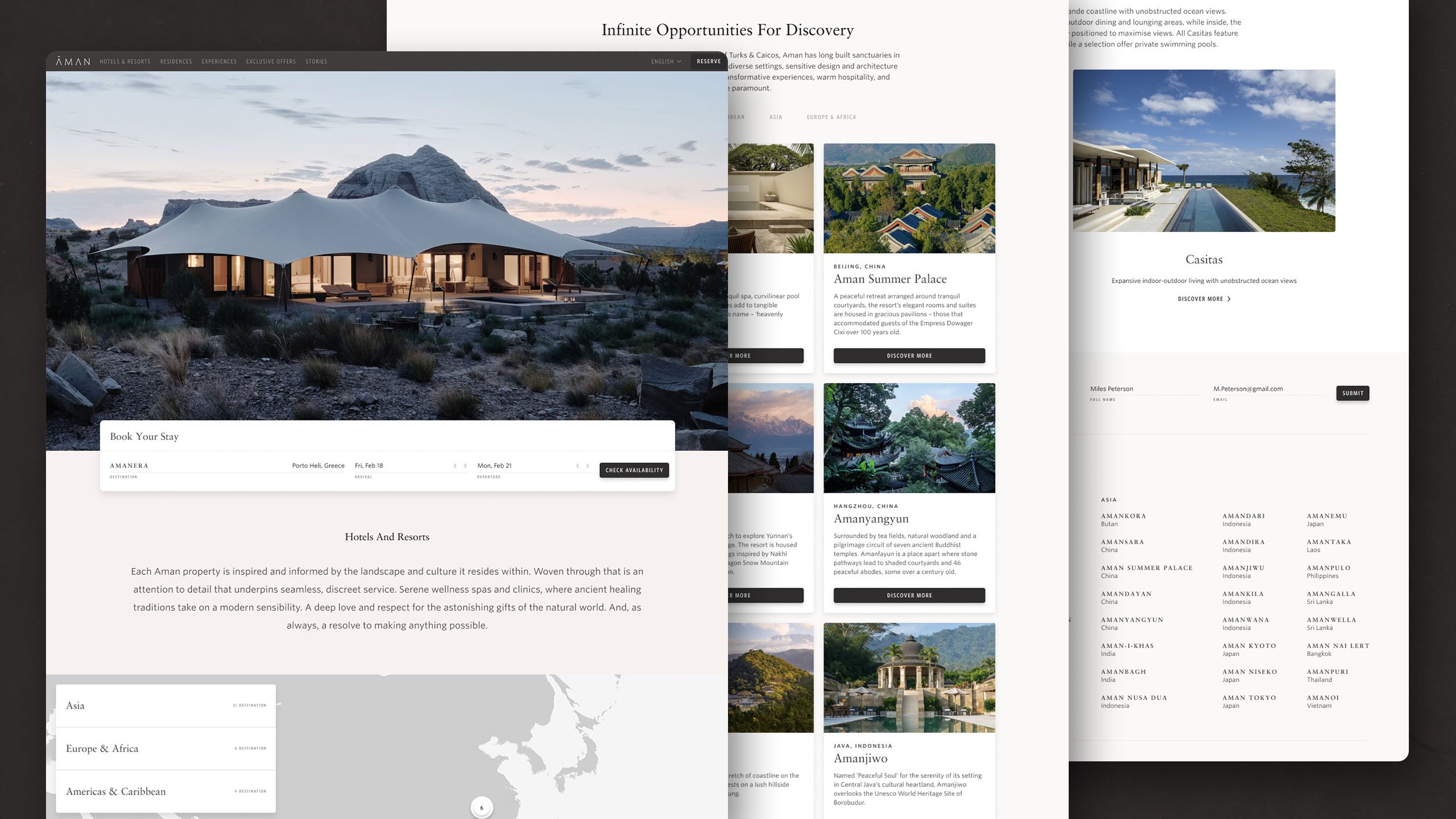
Display the resort name prominently as primary focus.
Display city and country consistently next to resort name as secondary info.
CTAs indicating where the user is being directed.
Tiles were inconsistently displaying content. If one destination was within a region that tile acted as a resort tile but in the context of other tiles which acted as gateways to a region.
It was important to make a visual distinction between the ownership parts of the website versus the rental. We decided a dark/light contrast would let the user know they’ve entered a distinct area of the website.
Defining grid & Content
Component: Booking
Research & Discovery
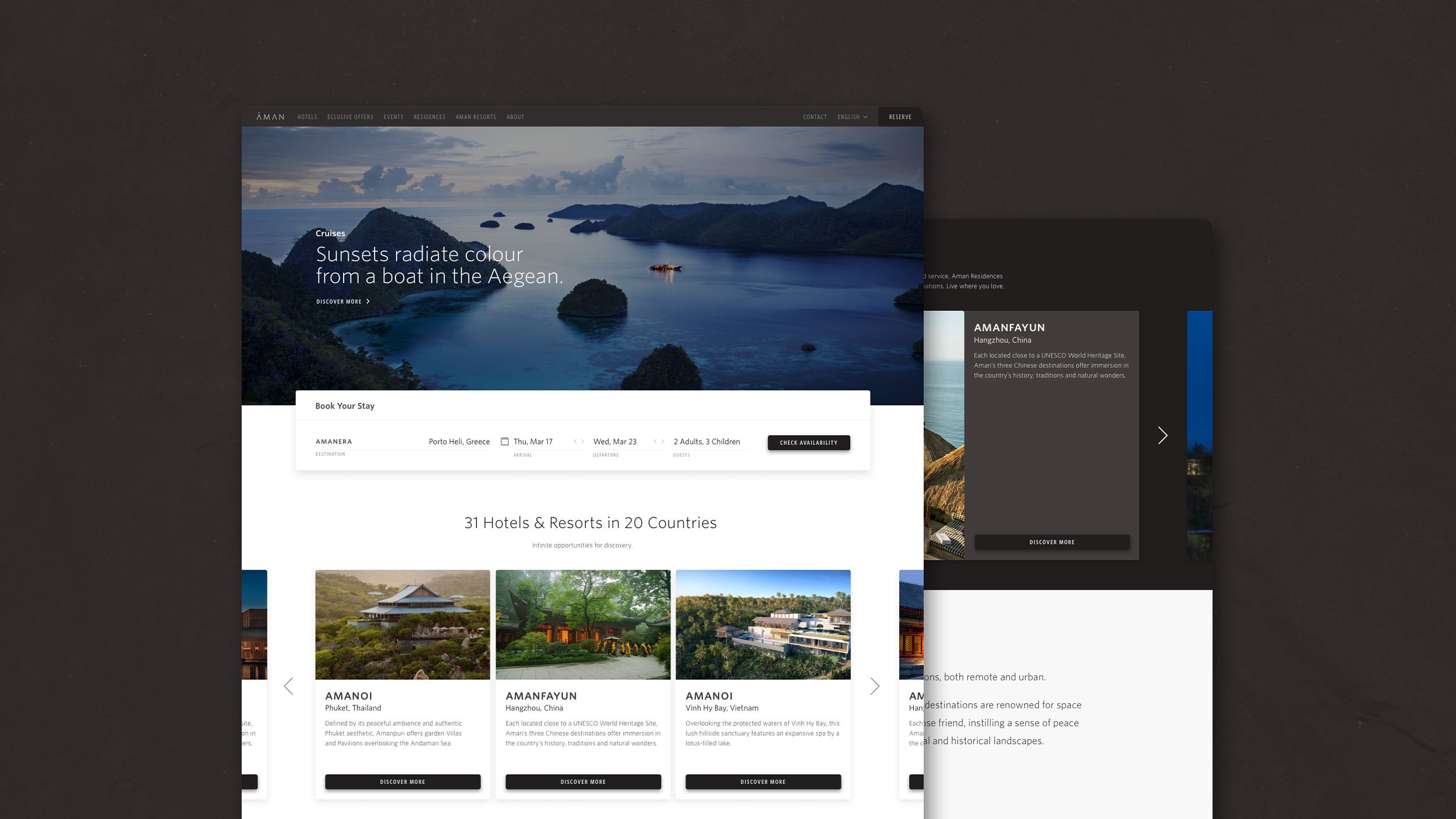
User expectations within the travel sector have outpaced the functionality of the existing Aman website, Lacking a simple way to book a stay online, requiring the user to contact a representative via phone or email. This created a frustrating and needless barrier between browsing and booking.
Approach & Goals
Construct an omni-present booking bar that integrates with the existing back end architecture.
Component: Navigation
Research & Discovery
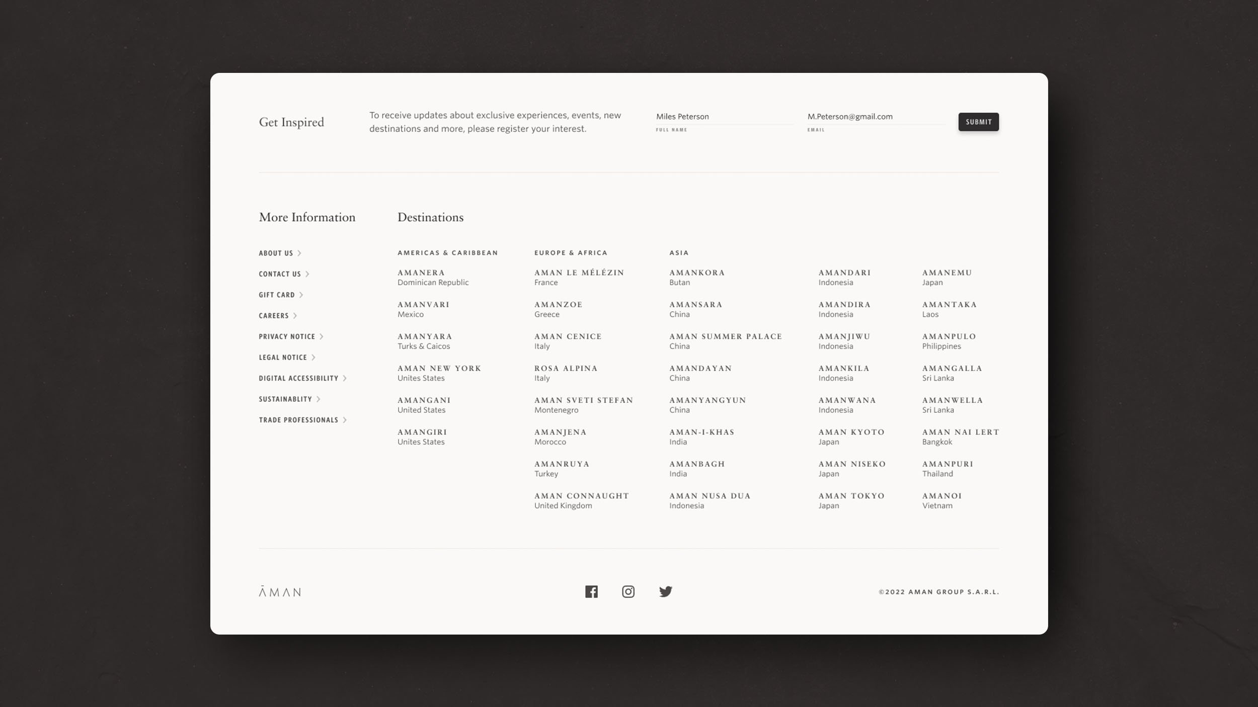
An outgrowth of the patchwork Information Architecture and laissez-faire content strategy was the progressive addition and excessive nesting of navigation components across the many destinations.
Approach & Solutions
—
High Fidelity Designs
Aman.com / Home
Aman.com / Hotels & Resorts
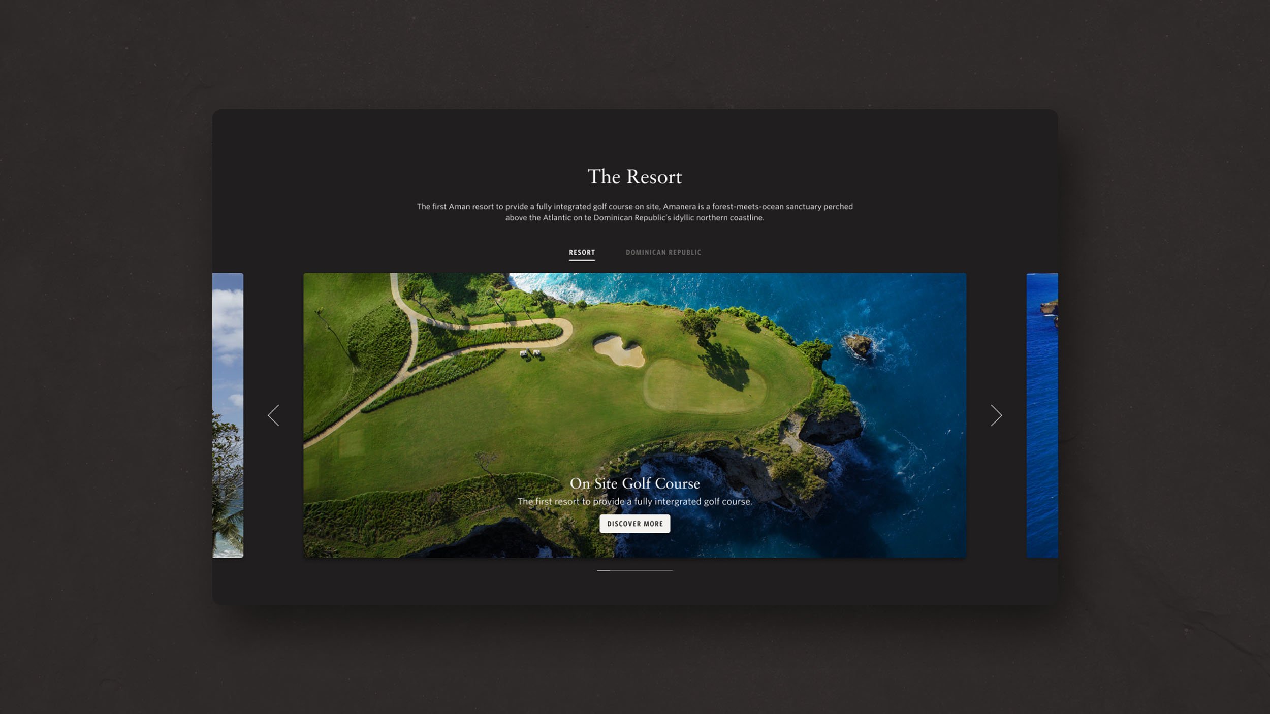
Aman.com / Hotels & Resorts / Destination
Aman.com / Residences
Aman.com / Residences / Destination


